I think it's obvious by now that I am drawn to the Opus X label design. Among the thousands of labels out there, it is hands down one of the best designs. I decided to try my hand at a second peice of Opus X work just focusing on the intertwined letters in the center of the label.
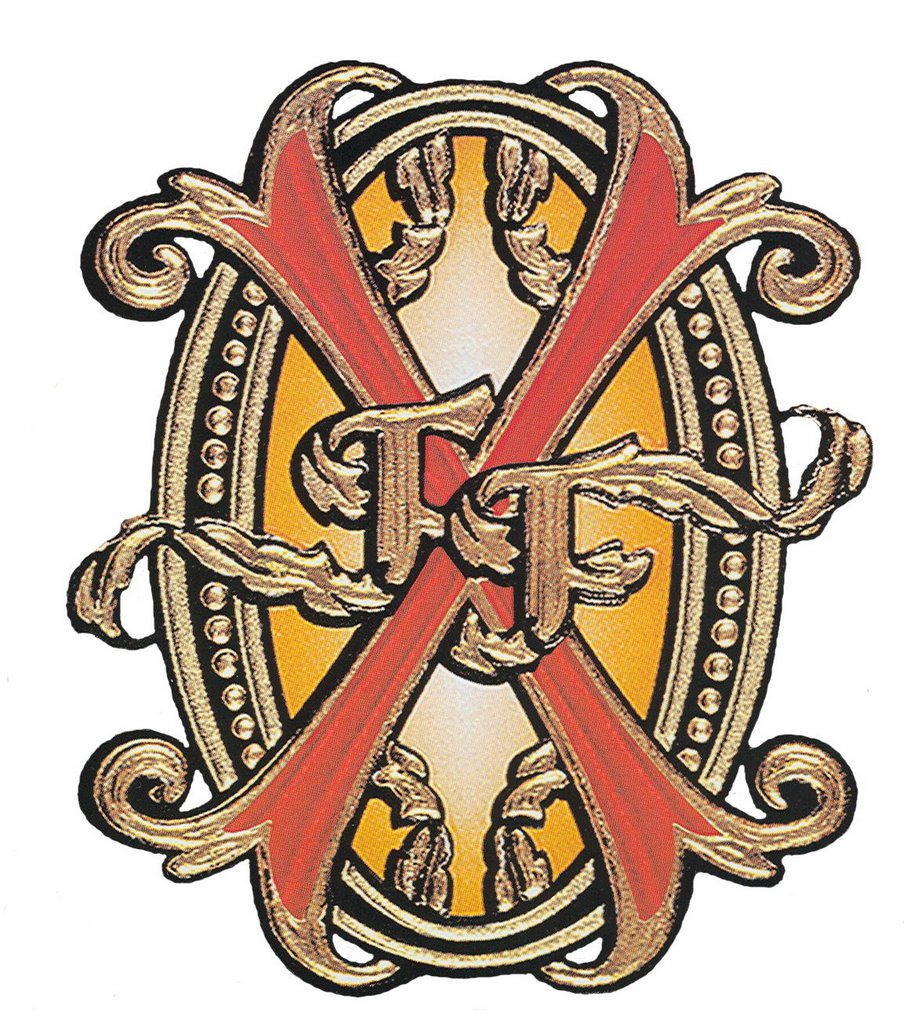
This artwork was taken from the back cover of the Prometheus DVD collector set. The whole Opus X label is so ornate, the center letters almost seem to get lost. Pulling the letters out of the design and allowing them to be free-standing really lets you see the beauty of that design.
I decided to try something different and carve the letters free-standing instead of in label form. The Celtic heart I carved for my good friend's marriage was very similar and was probably the inspiration for this piece.
No comments:
Post a Comment